

Introducing: The Kid Cover Test
Babyish, boring, or worth picking up? Our reviewers rate six covers a month.

When I asked on Instagram what people wondered about young readers, one of the top responses was, “What makes them pick up a book?” Two weeks later, I received a Book Matchmaking request from a parent who said that her 11-year-old son actively rejected anything with a “kiddish” cover. He would even check the covers of the audiobooks they wanted to listen to before he agreed to try them out.
This wasn’t the first time I’d heard about the plague that is the word, “baby-ish” or its alternative, “kiddish.” However, it did leave me wondering: “What makes a cover work for kids?”
Believe it or not, many kids judge books harshly by their covers. Often, they may not have as much experience or knowledge about what goes into making a cover and may conclude that the cover and the book’s contents are one and the same. Other times, the peer pressure is real and kids don’t want to be seen reading something that seems to be for younger readers.
I had many hypotheses on which covers kids like, what looks babyish to them, and and what specific elements make a book cover appealing to young readers.
Enter: The Kid Cover Test.
This new series aims to test how kids ages 8-14 respond to book covers—with the goal of figuring out what makes a cover work for them. Each month, I send out a group of six covers to all our kid reviewers asking them the following questions:
Based on the cover alone, would you pick this book up? (On a scale of 1-5)
Who do you think this book is for? (Kids older than you, younger than you, your age, grown-ups, other)
Why do you say so? (Subjective long text answer)
Which of these covers was your favorite? (multiple choice)
Which cover would you not want to be seen with? (multiple choice)
Did you know any of these books before now? (yes or no)
In July, I sent our reviewers the six covers below with the above questions and no other information:
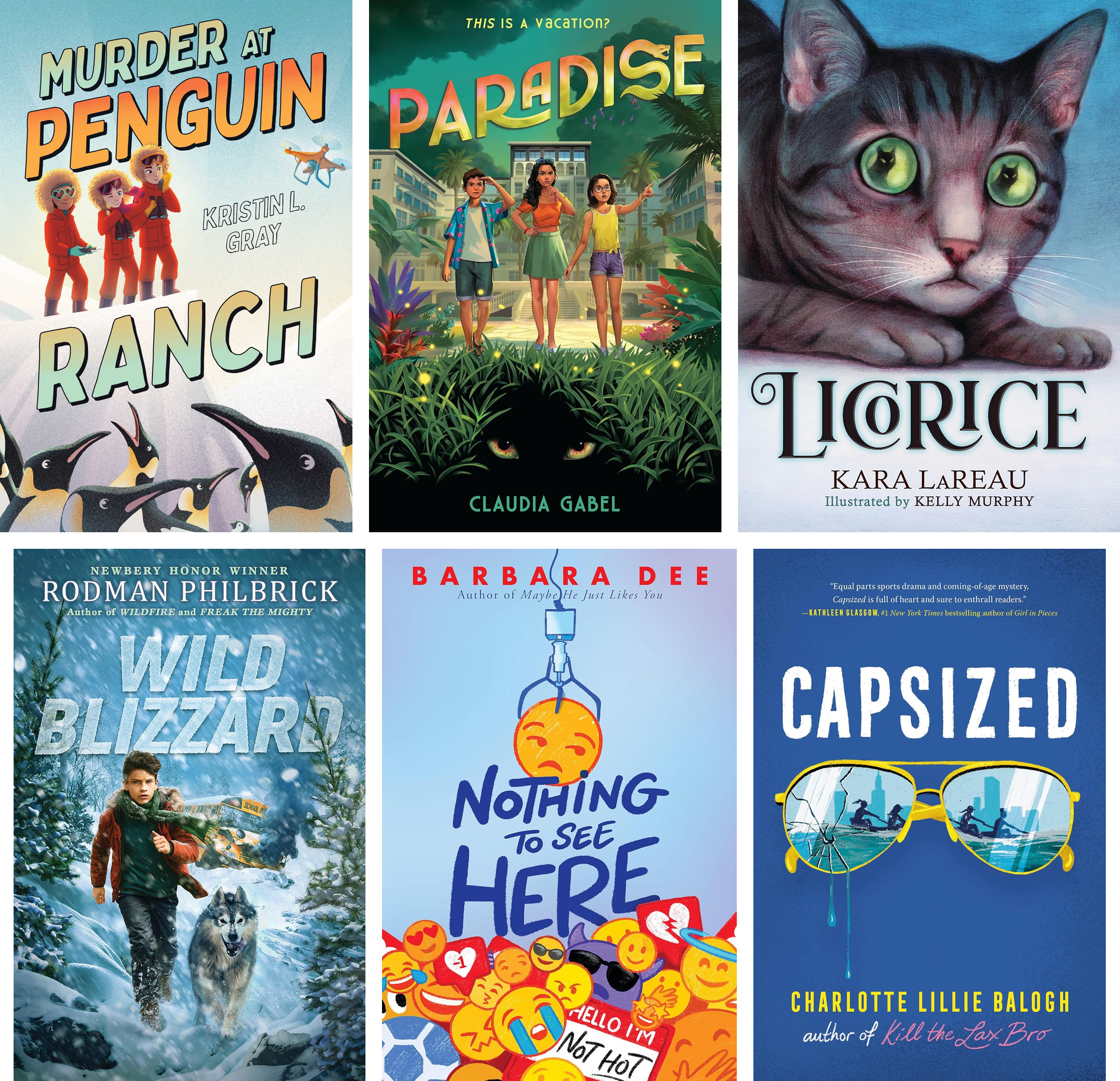
Nothing to See Here by Barbara Dee. Scholastic, October 20, 2026. Ages 8–12 (grades 3–7). Cover illustrated by Maithili Joshi.
Murder at Penguin Ranch by Kristin L. Gray. Simon & Schuster / Paula Wiseman Books, November 3, 2026. Ages 8–12.
Paradise by Claudia Gabel. Pixel+Ink, October 27, 2026. Ages 10–14. Cover illustrated by Raymond Sebastien.
Wild Blizzard by Rodman Philbrick. Scholastic Press, October 20, 2026. Ages 9-12.
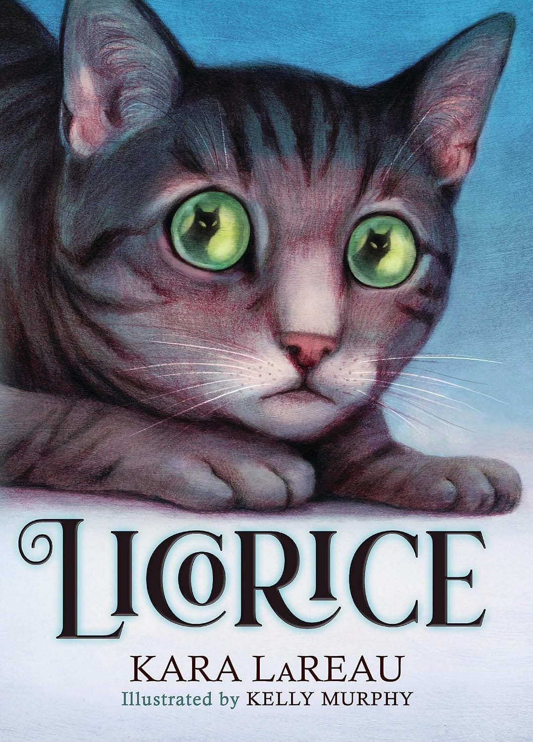
Licorice by Kara LaReau, illustrated by Kelly Murphy. Scholastic Press, October 20, 2026. Ages 8-12.
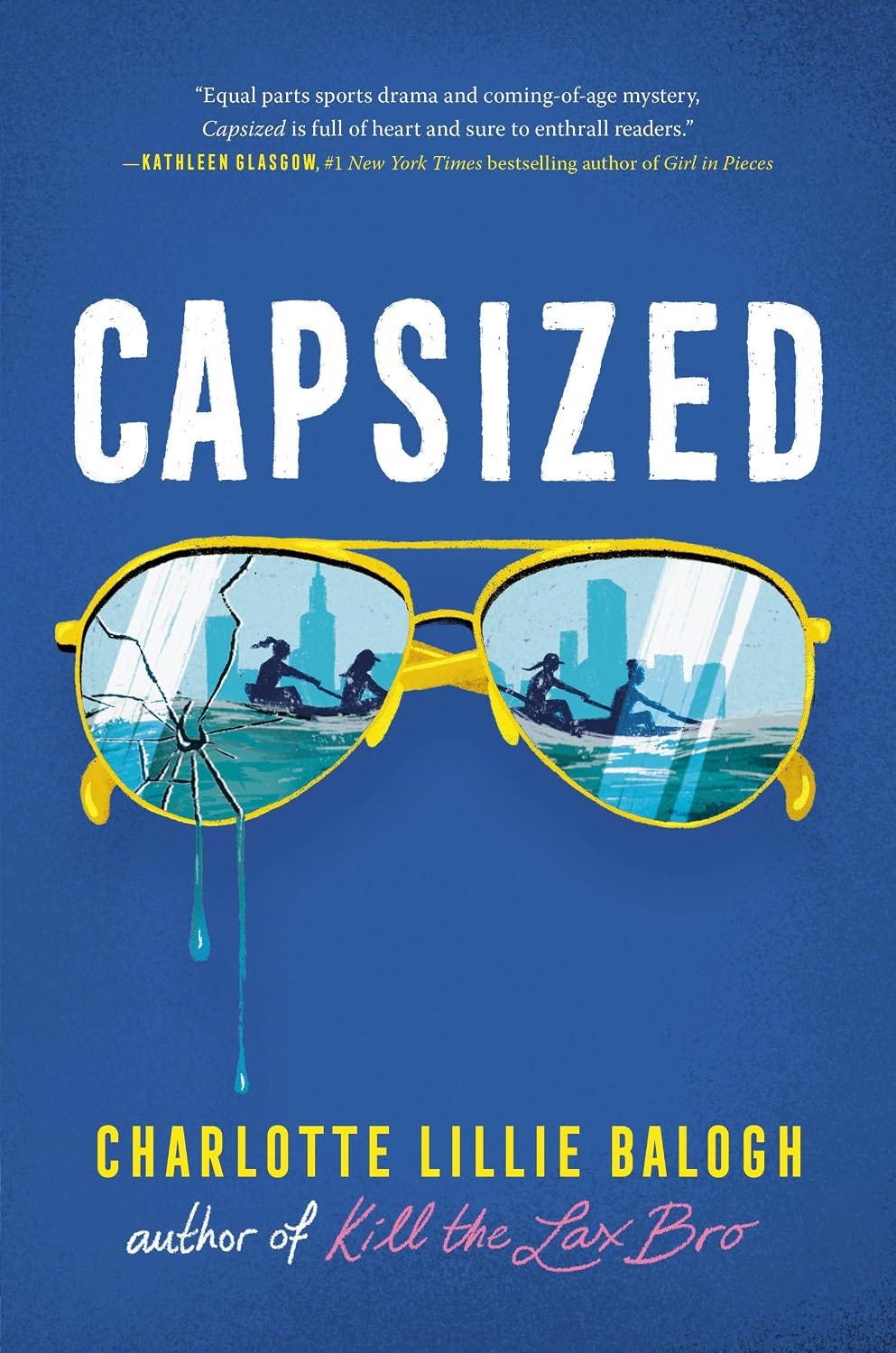
Capsized by Charlotte Lillie Balogh. Delacorte Press, September 8, 2026. Ages 12+
Their responses were fascinating!
What about a book cover makes kids pick up or turn down a book?
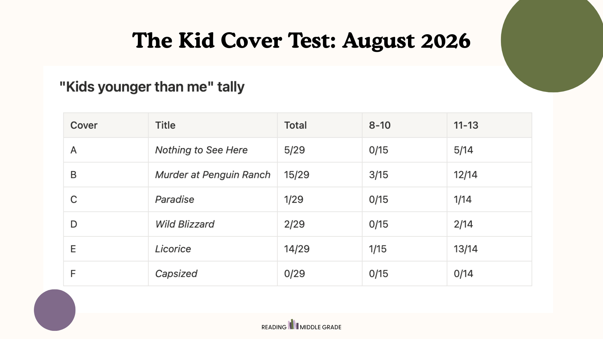
This month, 29 out of our 44 reviewers rated the covers. There were 15 in the 8-10 band, 14 in the 11-13 band, 21 girls and 8 boys. 27 of 29 reviewers didn't recognize any of the six books. Two recognized one book. The two reviewers were Paige, who recently read and loved Licorice (her review is coming in a couple of months!) and of course, her brother Miles, who’d also heard of it from her :)
Here’s how the ratings shook out at the end.
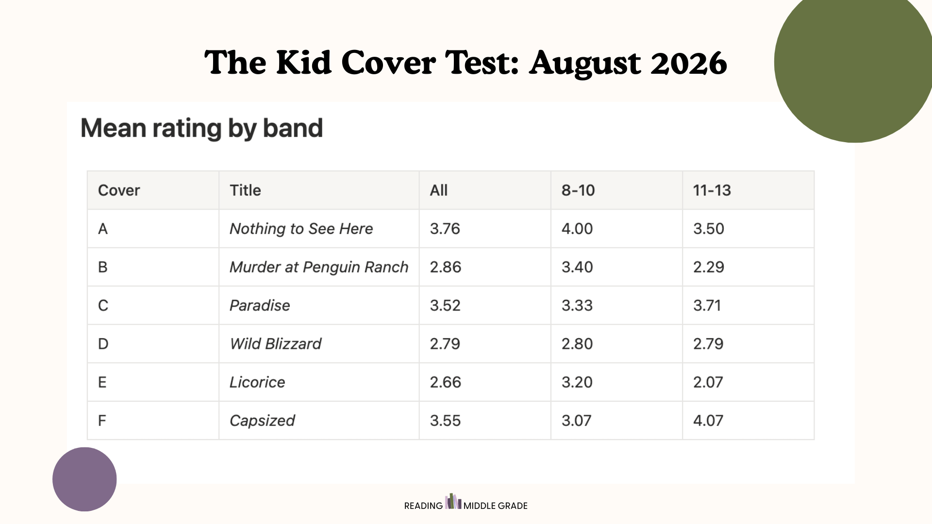
Even more interesting than the ratings (which we’ll come back to, I promise) are the kids’ words on each of these covers and the rationale for their choices.
Let’s break down our findings.
Intrigue
Kids—especially those over the age of 10—were really drawn to the idea of a cover that raises many questions. It appears that a cover that withholds, creates a mismatch, or plants a question outperforms a cover that states everything.
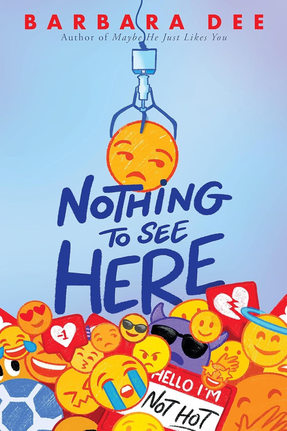
Caleb (11) on Nothing to See Here, rated 5, “kids my age”: “The cover art made it look interesting while not revealing too much of the book. That made me really want to find out what it is about and what happened.”
Tessa (11) on Paradise, rated 5, “kids my age”: “My first impression was ‘That’s a really cool cover. I like the eyes.’ The eyes show that this book is about this mysterious ‘paradise.’ I want to know what it’s all about. What are the kids looking at? Why is the sky green? Who do the eyes belong to? These unanswered questions make me want to pick it up and read it.”
Caleb (11) on Capsized, rated 5, “kids my age”: “This cover made me super curious to find out what the story behind the characters is, and how they fared and what they did in the story”
Miles (10) on Licorice, rated 5, “kids my age”: “The shadows in the cat’s eyes make it seem like a book for older kids... it’s not just a cute kitty.”
In a similar vein, many of our reviewers did not gravitate toward the covers they thought were “too simple” or “babyish.” Here’s why some kids said they wouldn’t pick up a specific book:
Luca (11) on Murder at Penguin Ranch, rated 2, “kids younger than me”: “The cartoon look and the simplicity”
Luca (11) on Licorice, rated 2, “kids younger than me”: “The name and the simplicity”
Tessa (11) on Licorice, rated 3, “I think this book would be for ages 8-11”: “This cover is slightly intriguing to me because the cat’s eyes look like they’re reflecting an evil-looking cat. However, I don’t feel the need to look at the cover for long because there’s not a lot to it. I think the cover could be better if it had a little more to it.”
Taste
We’ve talked a lot about age perception and appeal and how it impacts which book covers appeal to kids. But age recognition isn’t the only factor that determines appeal. Kids may rightly perceive a book cover as targeting kids their age but still not be drawn to it for a variety of reasons related or unrelated to the quality of the cover.
Ramona (9) on Licorice, rated 2, “kids my age”: “Because it just seemed very bland and simple”
Cora (12) on Wild Blizzard, rated 1, “kids my age”: “The boy looked my age and it didn’t look very exciting.”
Avery O. (9) on Murder at Penguin Ranch, rated 2, “kids my age”: “I hate murder stories, but it also looks like something a lot of kids my age would be interested in”
Nellie (10) on Wild Blizzard, rated 2, “kids my age”: “I don’t like severe weather conditions in books or real life.”
Emma (12) on Paradise, rated 2, “kids my age”: “I wouldn’t pick this book because it looks like an adventure or realistic fiction book and thats not what i like to read. It looks to be for 12 yr olds.”
The perceived age of the characters
Kids are always looking for relatability and book covers can often signal to them that a story is designed for an older or younger audience depending on the way the characters look.
For all of the covers, one thing kept showing up: Older kids police the age signal hard. A cover that reads even slightly young can get a book written off. Younger kids, on the other hand, rarely care and are willing to read almost everything for their-age-or-older—unless it looks too scary or romantic.
Neither younger nor older looking characters on the cover are necessarily bad. It just depends on the age of your target audience. If your book is YA or upper middle grade, you should be targeting readers ages 11 and up. If the characters on your cover look like elementary schoolers, you’re essentially telling most older readers to back off.
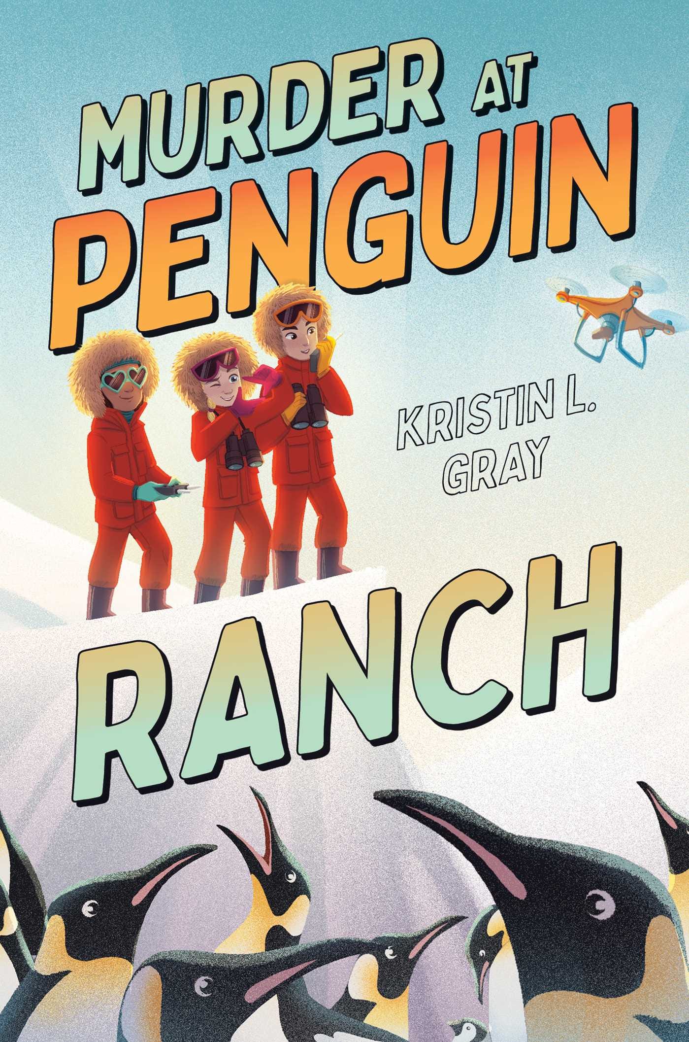
Many of our older readers immediately ruled Murder at Penguin Ranch as too young because of the assumed age of the characters on the cover:
Emma (12) on Murder at Penguin Ranch, rated 1, “kids younger than me”: “the age of the main characters on the cover and the fact that the book is about penguins. I would guess 6-8 yrs old is the audience. It looks like the show The Wild Kratz”
Maeve (13) on Murder at Penguin Ranch, rated 2, “kids younger than me”: “First of all, the kids on the cover looked young, which, along with the animal themes, made me believe this was for kids on the younger side of the 8-12 range.”
Magnolia (12) on Murder at Penguin Ranch, rated 2, “kids younger than me”: “It feels like a story that would be suspenseful but nothing was wrong in the end. Also, I thought the title was ‘Murder At Penguin’ because there were people in between it.”
Hattie (13) on Murder at Penguin Ranch, rated 2, “kids younger than me”: “The age of the kids on the cover”
In contrast, several kids in the younger band were drawn to Paradise because the cover characters looked older:
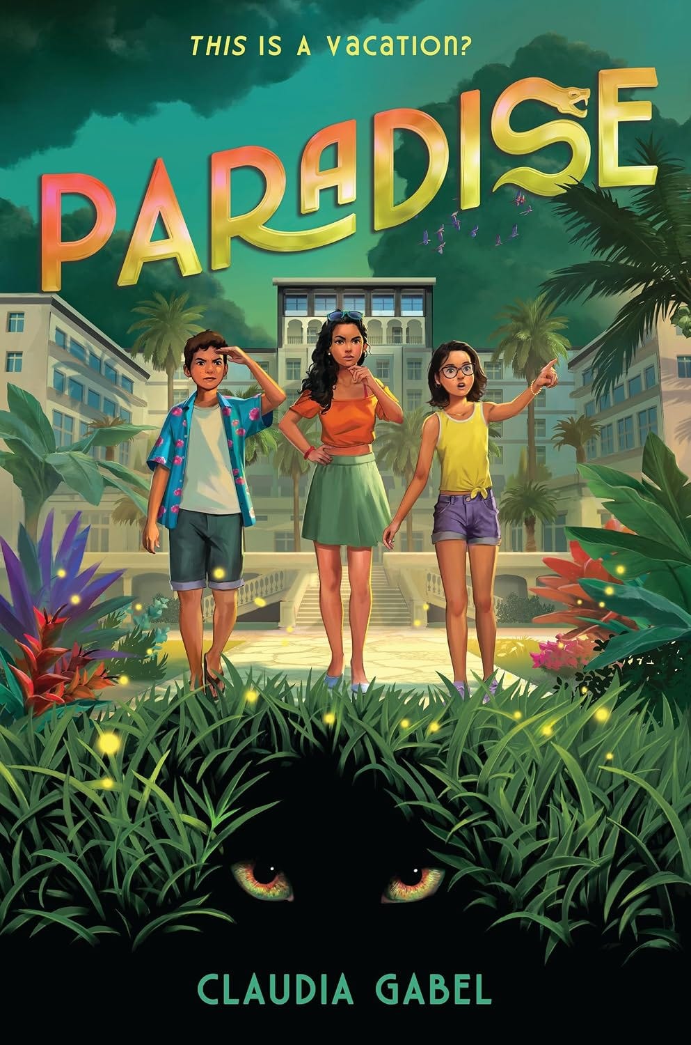
Adeline (10) on Paradise, rated 5, “kids older than me”: “The eyes look kind of creepy, and more ‘in the shadows’ sort. The kids look more like thirteen-year-olds than ten, and the book looks like a mystery.”
Meera (9) on Paradise, rated 4, “kids older than me”: “This looks like something my older sister would read. The picture shows something scary that younger kids might not want to read, but I would!”
Sometimes, it’s not the cover
It might not be age perception, it might not even be the cover. One of our lowest scoring covers is this one of Wild Blizzard by Rodman Philbrick, which I thought was fantastic!
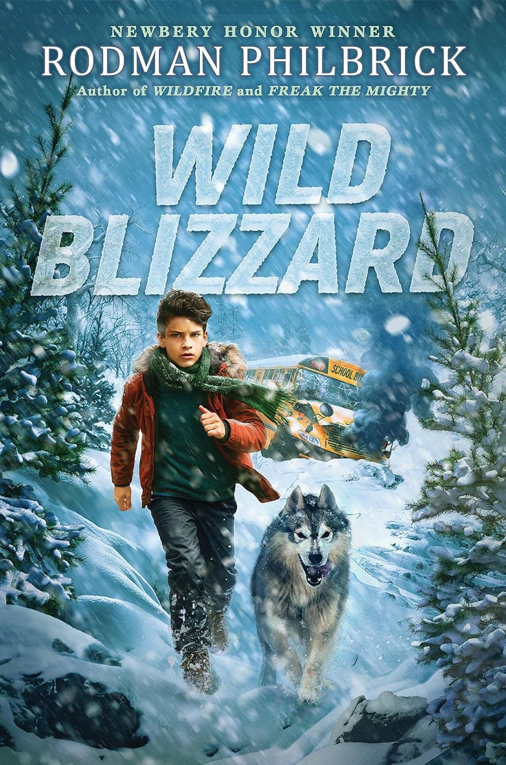
Many kids felt differently. Interestingly, though, the reason why some kids “disliked” the cover (or said they wouldn’t pick up the book) was the same reason many others were eager to pick it up.
The “I’ve seen this before, no thanks” group:
Maeve (13), rated 2: “it also reminds me a lot of I Survived and other ‘classic’ middle grade survival books, which I’m not a huge fan of. I probably wouldn’t pick this up unless I heard it was much different from the books it is obviously marketing itself to be similar to.”
Magnolia (12), rated 1: “I wouldn’t read it, because it makes me think of hatchet by Gary Paulsen. Which I didn’t like.”
Emma (12), rated 1: “it reminds me of white fang but younger. Not a big fan of survival stories.”
Ramona (9), rated 1: “it seems kind of like I survived and in I survived there is something unsafe in real life.”
The “Yes, I know what this is and I like it” group:
Adeline (10), rated 5: “The blizzard and the crashed bus seems to be giving ‘I survived a bus crash and a snowstorm’ vibes.”
Wren (9), rated 4: “it reminds me of I Survived books which are for kids my age.”
Franklynne (10), rated 3: “Seems like an I Survive book.”
Avery L. (13), rated 5: “It looks like a survival story, and i’ve noticed that a lot of kids my age like reading about.”
You know what this means—low scores or not? The cover isn’t failing, it’s communicating perfectly. It’s telling kids exactly what it is and lowering all chances of disappointment. This means that 100% of the kids who pick this up will know what they’re getting into. Is that boring? A bit. Is it reliable? Absolutely.
The blurbs?
A book’s cover is more than the illustrations and title. It also encompasses blurbs, subtitles, and illustrator credit.
One thing I wasn’t expecting was that a few of our older reviewers rated some books higher because of the paratext—something else on the page besides the cover and title.
Avery L. (13) on Licorice, rated 3, “kids younger than me”: “I also noticed that it has pictures, because it says the name of the illustrator at the bottom. That is often another sign of a book for younger kids.”
Hattie (13) on Capsized, rated 3, “kids my age”: “Kathleen Glasgow’s quote. I know she is a YA author.”
Caleb (11) on Paradise, rated 4, “kids my age”: “The question on the cover made me nervous and excited to find out what it means and what happens to the characters”
Emma (12) on Capsized, rated 4, “kids my age”: “the captions and quotes made me consider trying this book. Its not love but i would consider it.”
Emma is a pure romantasy reader who has been drawn into a contemporary mystery because of the “captions and quotes.”
It’s worth noting that no reader under 10 noticed or mentioned any paratext. Are blurbs wasted on middle grade books, then? It would appear so—at least for these kids. What a couple of younger kids did notice is the tension between the cover and the title of Gabel’s Paradise:
Avery O. (9) on Paradise, rated 5, “kids older than me”: “I would be interested in this book because the setting doesn’t match the book title at all and that seems intriguing to me”
Ramona (9) on Paradise, rated 5, “kids my age”: “Because it seems like it is supposed to be one thing but it is really a whole different thing so they have to keep it a secret”
Again, intrigue and mystery win!
How did these six covers do?
If you’re an author with any say in your book cover, it’s worth taking note of these findings because you want your book cover to speak to your book’s target audience.
Two covers read as being for younger kids
Out of our six covers, two kept getting flagged as too young. 15 out of 29 kids pegged Murder at Penguin Ranch as being for younger kids. Three of those reviewers were aged 10 or younger (which I thought was hilarious).
Zily (9) on Murder at Penguin Ranch, rated 3, “kids younger than me”: “It’s interesting, but little kids interesting.”
Caleb R. (12) on Murder at Penguin Ranch, rated 2, “kids younger than me”: “The cover looks very childish”
Thomas (12) on Murder at Penguin Ranch, rated 2, “kids younger than me”: “The books cover looks like it might be babyish.”
14 out of 29 kids rated Licorice as being for readers younger than them. It was saved by the intrigue in the eyes of the cat—and Miles’s and Paige’s ratings—but still rated lower by nearly all the kids over the age of 10.
Maeve (13) on Licorice, rated 2, “kids younger than me”: “Animal books pretty much always read much younger than my age, even if older middle grade readers are their intended audience... I find them cliché, boring, and often forced.”
Caleb R. (12) on Licorice, rated 2, “kids younger than me”: “The cover is a bit boring and childish”
Cora (12) on Licorice, rated 2, “kids younger than me”: “It looks kind of childish”
The older readers were sold on these two covers
Two out of six covers were consistently rated as being for older readers. Most importantly, they were often also rated positively, if a bit scary for the younger reviewers.
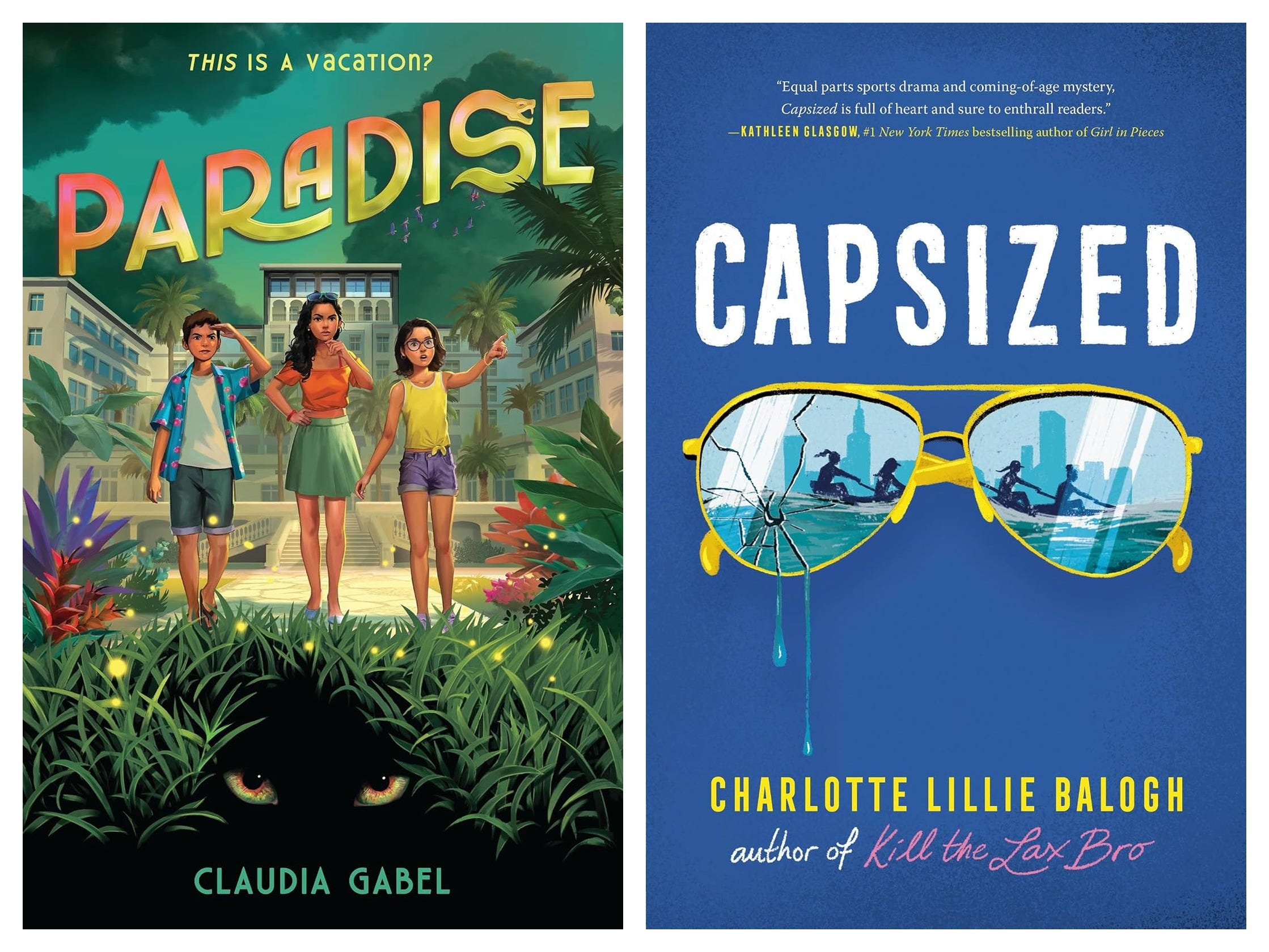
Claudia Gabel’s Paradise has several fans waiting in the wings to read it when it releases this fall. How wonderful, because it appears to be the first in a series! The cover’s crossover appeal is strong as kids ages 8-12 all rated it 4 or 5 stars!
Our fearless young readers were intrigued by the mystery this one promises:
Zily (9), rated 4, “older than me”: “It has a lot of details, and if you’re older, you’ll understand it better.”
Paige (8), rated 5, “older than me”: “Snakes and creepy eyes are my kind of book, but maybe not all 8-year-olds?”
And from the older band, straight approval:
Charlotte (12), rated 4: “It’s still animated but it’s not as babyish as some other books. The eyes in dark make it look it’s a mystery.”
Danielle (12), rated 5: “I pick up books with covers that are more detailed. This cover makes me think that I would really like this book.”
Our other favorite, Capsized, also had crossover appeal, but didn’t catch our 8-year-olds as it was obviously more “grown-up” in appearance:
Nellie (10), rated 4, “older than me”: “I would still like to pick it up even if it’s for kids older than me.”
Avery O. (9), rated 4, “older than me”: “This cover makes me automatically think this is for older kids because it looks super serious, but at the same time looks like a book that pulls me in straight away.”
Wren (9), rated 4, “older than me”: “It looks like a more mature I Survived, and it’s a more simple cover like grown up books.”
Older band, strong approval:
Maeve (13), rated 5: “The cover has an interesting design targeted to older middle-grade/young YA readers... A sports novel about a fascinating sport I know very little about, with the promise of some drama? Score!” (Notice how Maeve is reading the blurb here?)
Avery L. (13), rated 5: “This looks like a lot of the books I read. It looks like it would be the story of a great adventure.”
Which books would kids not want to be seen carrying?
The two covers kids most wanted to hide are the same two that read youngest, Murder at Penguin Ranch and Licorice.
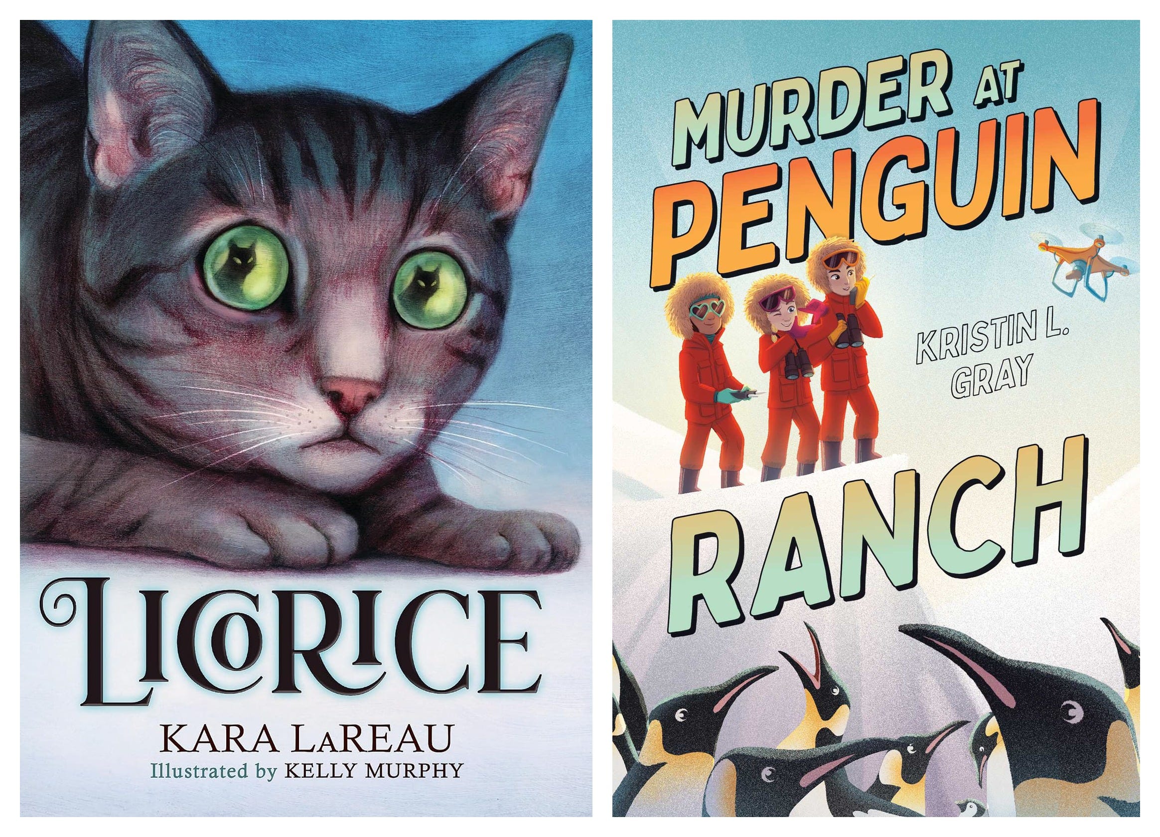
Licorice makes total sense to me because of the animal on the cover even though I have yet to read the book (I have an ARC, and Paige was a huge fan, so soon!) because yes, animal books tend to be for that 8-10 range and that’s fine.
Murder at Penguin Ranch is one of those covers that might have a packaging and title mismatch issue. The cover had a strong “for younger kids” vibe, but while many of the younger kids loved the drone and the penguins, a few were put off by “Murder” in the title—something that older audiences who might have been drawn to a slightly older cover image might have appreciated. This splits the young audience further.
I’ve yet to read all the books in today’s round up, but I’m eager to find out how they stack up against their covers. The proof is, after all, in the pudding.
Something I loved with this question, though, is learning that 8 of 29 kids didn’t care about being judged. Two went on to leave me a comment at the end about this fact:
Tessa (11): “I don’t care about what books people see me reading or carrying.”
Magnolia (12): “I have gotten so used to bringing books anywhere, I just am like, ‘leave me alone. Let me read my book. I don’t care if you think it is babyish or scary. I want to read it. Stop talking to me.’”
Honestly? I love it for them.
So, which books “won” the Kid Cover Test this month?
By favorite votes: Nothing to See Here ran away with it at 11 votes. Paradise second at 7, Capsized third at 5. Everything else was in the low single digits.
By average rating, however, it’s a bit tighter: Paradise comes in third with a 3.52 rating, Capsized is second with a 3.55 rating, and Nothing to See Here wins fair and square with a 3.76 rating.
Why did this book cover win?
The results on this book’s cover were truly curious! It received a real mix of ratings in terms of age perception:
11 of 15 kids ages 8-10 rated it as being for kids older than them
5 of 14 kids ages 11-13 rated it as being for kids their age
5 of 14 kids ages 11-13 rated it as being for kids younger than them
2 of 14 kids ages 11-13 rated it as being for kids older than them
So the overwhelming response from the younger readers was that this book is for older readers. Seven older kids rated it as either being for their age or older. Still, not all older readers felt that way. Why the all-over-the-place ratings?
It’s the emojis!
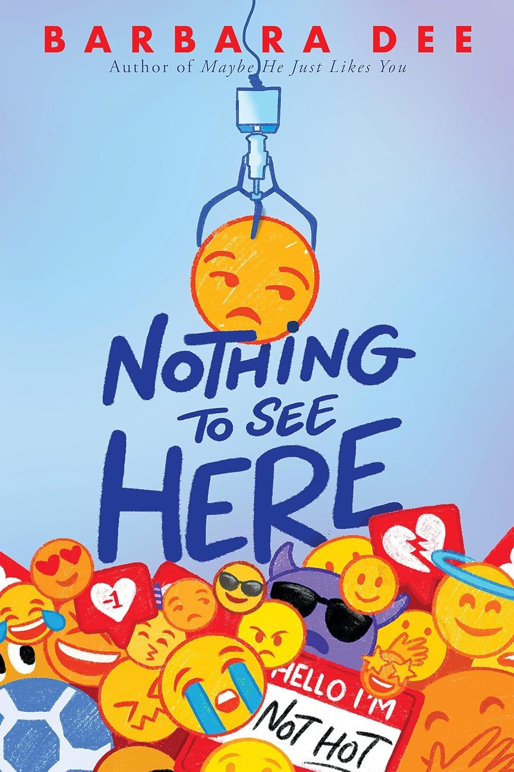
Younger kids read the emojis as being for their age or older:
Johan (9), rated 4, my age: “It has emojis on it and I think a lot of kids my age like emojis.”
Miles (10), rated 4, older: “The emojis, because most kids my age don’t have phones.”
Zily (9), rated 3, older: “I just don’t have facebook or instagram, so I don’t think I use emojis.”
Some older kids read the exact same emojis as younger/kiddish:
Hattie (13), rated 2 “younger than me”: “The emojis just feel slightly kiddish to me.”
Eli (13), rated 4 “younger than me”: “The emojis.”
Luca (11), rated 4, “younger than me”: “All the emojis and how simple it is.”
And one kid held both reads at once:
Charlotte (12), rated 4: “the emojis look kiddie. But the ‘not hot’ name tag seems like something older kids would say.”
20 of 29 kids rated it 4 or 5 (leaning toward, “would absolutely want to read), and only 3 rated it below the midpoint.
The most fascinating thing about this cover is that although the age signal was contested, the appeal wasn’t. Many kids—see Eli and Luca—who said that the emojis read younger still wanted to pick up this book!
I have two theories why:
No faces means no age to reject. This cover has no people on it, so kids can’t run their usual “the kids look too young / older than me” calculation, and nobody gets firmly excluded. A faceless cover rarely tells a kid “this isn’t for you.” Gordon Korman’s publishers might be on to something.
A busy, clue-loaded cover gives every age something to find. The covers that pulled kids in were the ones with a question or a hidden detail; the ones that lost kids were “too simple, not a lot to it” (Licorice, Penguin Ranch). Nothing to See Here is the opposite, a claw machine, a “meh” emoji being pulled out, a heartbreak emoji, and the “Hello I’m Not Hot” nametag, which is a clue that rewards a second look. Younger kids read the emojis; older kids catch the nametag gag. There’s something to decode at every age.
Whatever the reason, this cover (and the book, which I’ve read and LOVED!) is our winner! The cover art is by Maithili Joshi.
Covers aren’t for us
After 3000+ words investigating book covers, you might be wondering, “Who even cares? What matters is the book and what’s inside!” Right?
I thought all of six covers today were pretty cute. I would have been enticed to check all of them out. But kids often don’t feel the same way adults do about book covers. They’re usually looking for elements that we might not consider valuable and ignoring others that might be more highly-regarded by adults.
Figuring out which elements work for young readers is how you get them curious about your book. Like 13-year-old Maeve said, “Lots of kids (including myself sometimes) will take a quick glance at a cover and then put it back, sometimes thrown off by something that isn’t a huge factor in the book. Knowing what details in covers turn kids against a book is crucial to making recommendations to them or designing a cover.”
💬 Your turn!
What covers would you like us to test next? What else do you want to know about how kids view book covers?
If you’re new here

Hi! My name is Afoma and I run the website Reading Middle Grade—of which this Substack is an extension. My goal is to help parents and educators find the books their tweens actually want to read. I write essays about the children’s publishing landscape, share weekly agony aunt style recommendations tailored to specific parent requests, and keep authors and gatekeepers abreast of reading trends among kids ages 8-14. You can subscribe below to get new posts in your inbox.
🥰 If you love what I do, would you please do me a quick favor?
❤️ Like this post
🔁 Share my work with your network.
If you’re on Substack, restack this post to your friends and followers, and if you’re getting this in your inbox, use the link below to share my Substack with your friends who need good books for kids in their lives.
📚 Want more?
Consider becoming a paid subscriber to my Substack. You’ll gain access to free Book Matchmaking, my monthly new release and recap posts, and my annual Summer Reading Guide.
👩🏽💻 Here are some of the most popular posts behind the paywall


Thanks for being here,
Afoma.
This post includes affiliate links, and I may earn a small commission when you make a purchase through my links.
This was sooo interesting!! I love all the thoughtful insight from these readers!
This is so interesting! Thanks for sharing!